Rave Media Redesign
Spring 2017 | Rave Media Redesign
WeMesh Inc. (rebranded as Rave Inc.) is a company located in Waterloo. The company developed a social video playback app where users can watch videos with friends and chat about it in real time.
I worked at WeMesh before it was rebranded as Rave Media as a UI/UX Designer.
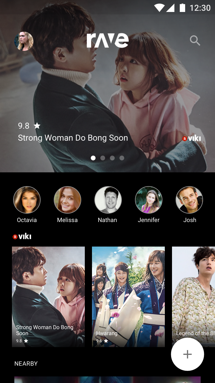
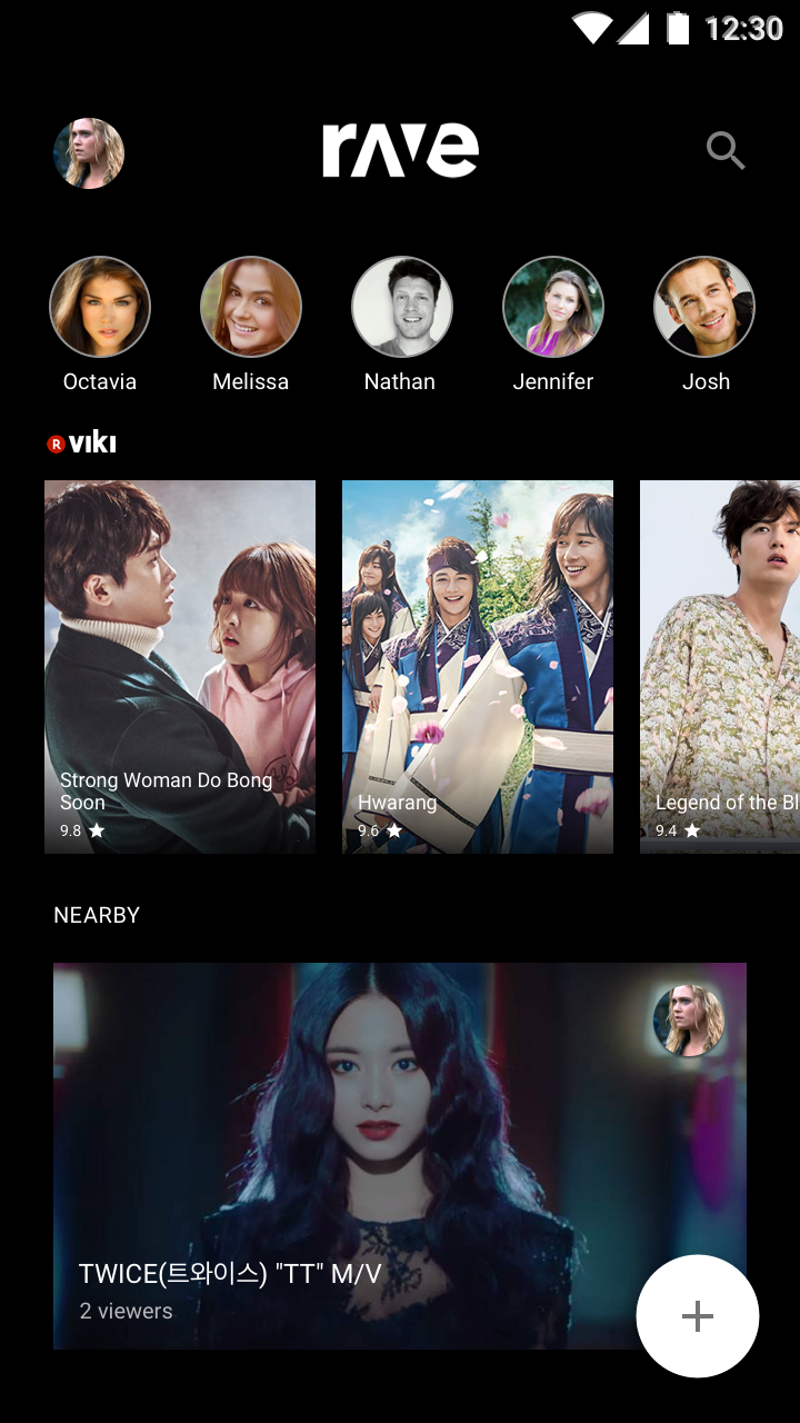
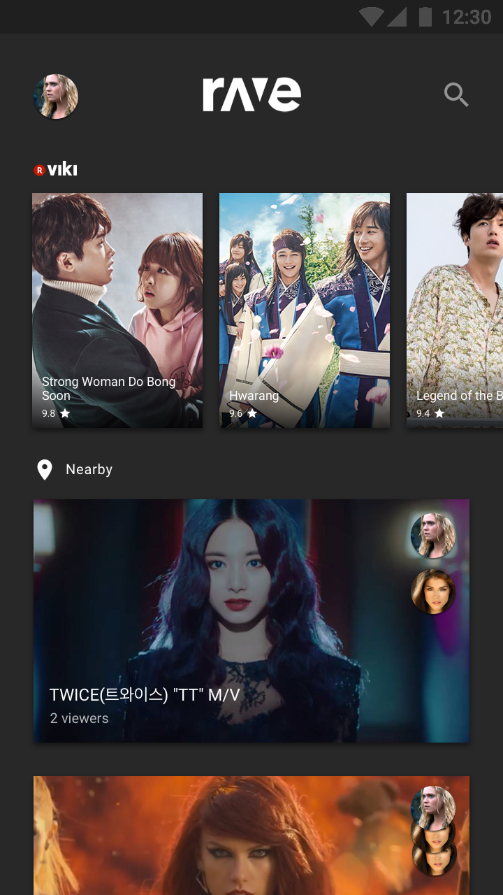
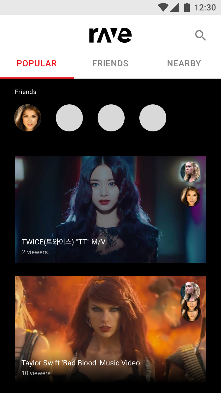
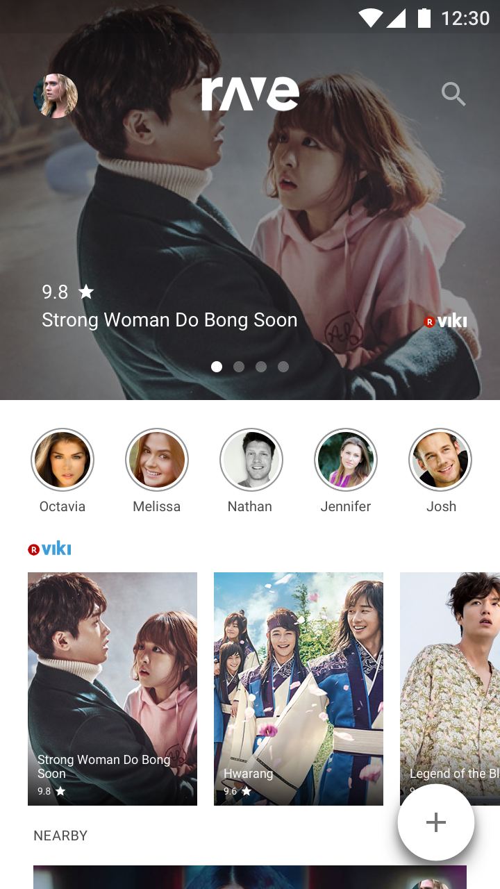
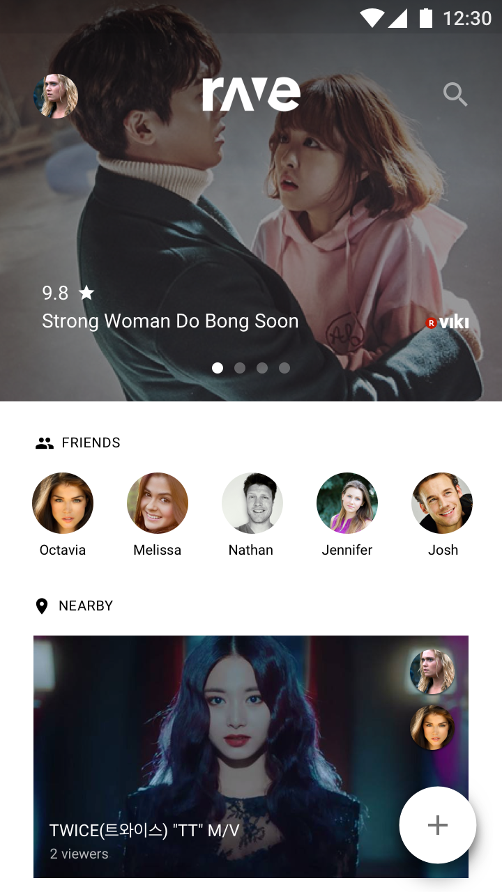
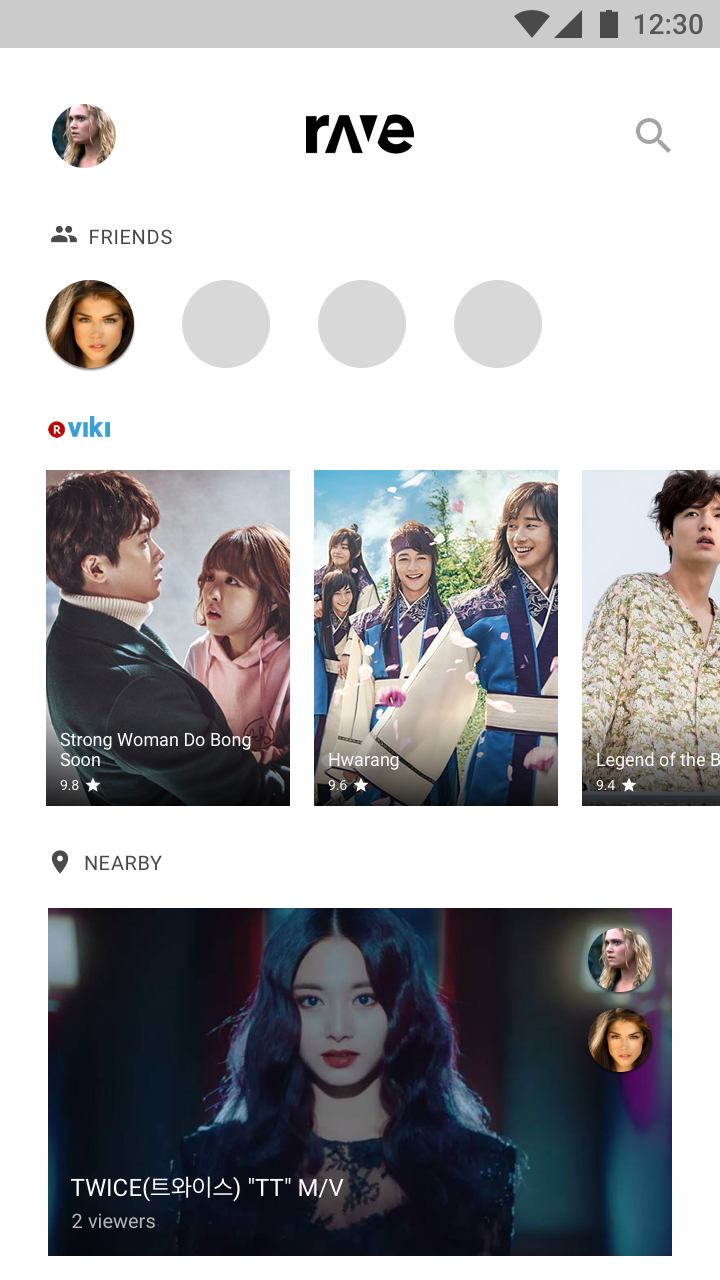
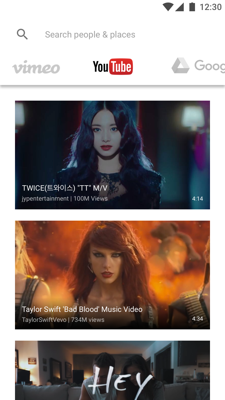
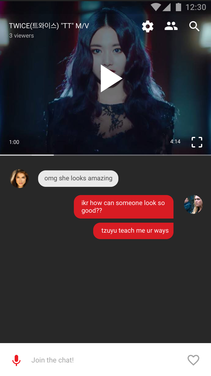
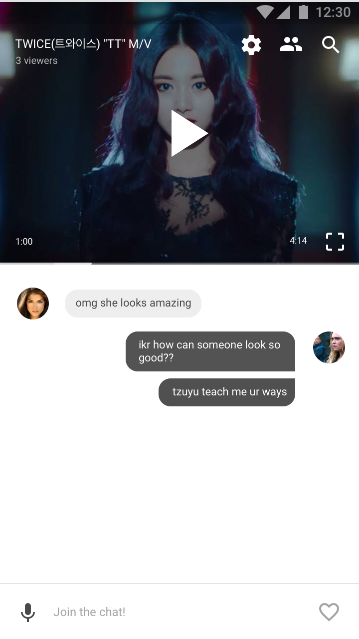
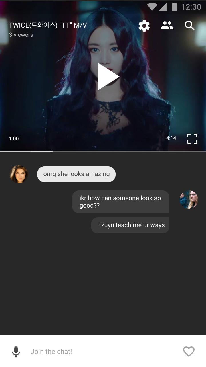
After seeing the new theme and logo, I experimented with the layout and colour scheme of the app.
Duration: 2 days
Roles: UI/UX Design, Visual Design
Tools: Sketch, Photoshop, Illustrator
Rave Media Redesign
The colours of the new logo were black and white as opposed to the original red logo. I first tried out black and very dark gray as the main colour in the background. The dark background gives the app a cinematic feel and is easier on the eyes. I also tried the layout with a white background and it gave the app a very clean and neat look. Another theme I attempted was adding a red accent colour, referencing back to the old red logo.
