Yelp Design Challenge: Zoo Time
Spring 2018 | Product Design
Zoo Time is a mobile app designed for Yelp's Design Challenge. Below is a link to an interactive prototype made with Atomic.io.
Duration: 6 days
Roles: UI/UX Design, Visual Design, Product Design, User Study, Research
Tools: Photoshop, Illustrator, Atomic.io
The Challenge
Create an app that allows someone to plan their zoo visit ahead of time.
Initial Research
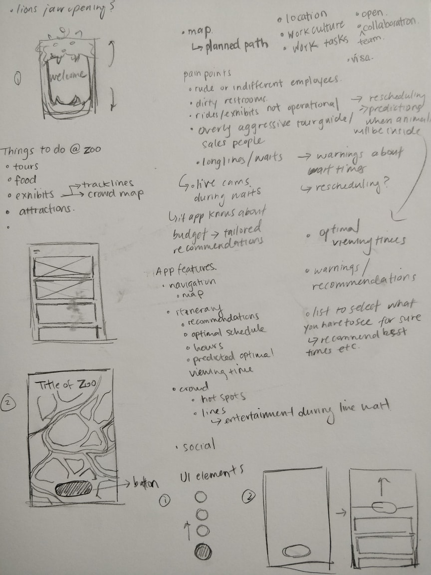
Upon reading the challenge, I jotted down initial thoughts and ideas such as potential features or design elements that came to mind. Before I continued further, I conducted research to find the target users and common frustrating experiences at the zoo.
Who are visiting zoos?
Visitors are primarily:
- Women/mothers
- Young families with children under 12
- Age 25-35
As shown above, visitors are usually families and adults aged 25-35. In a survey, 78.1% of respondents that visited the zoo have at least one child. This indicates the target users are mostly young parents (millennials).
From previous research conducted for a project in a previous co-op position, it is known that millennials are generally tech savvy. They are comfortable with a mobile device and usually use their devices one-handed.
What are some common pain points?
Common pain points included:
- Large crowds
- Rides/exhibits not operational
- Long lines/waits
Visitors stay an average length of 4.8 hours at the zoo according to a survey. They only have a limited amount of time to explore exhibits, attend events, go on rides, and eat lunch. Long waits at the ticket booth or at an attraction can be frustrating and disrupt plans. Large crowds can be stressful and cause long waits to see an exhibit.
Brainstorming Solutions
After researching target users and common pain points, I started brainstorming potential solutions. This included potential app features that could prevent these frustrations or enhance the experience of planning and going to the zoo.
Large crowds
- List special events
- Recommend exhibits based on the user’s interests so the “best” exhibits are visited first
- Crowd heat map
Rides and exhibits not operational
- Predict/display exhibit closures
- Live updates on unexpected closures
Long lines and waits
- Predict peak hours or popular days
- Live updates on wait times and crowds
- Provide entertainment while waiting
Other features
- Livestream of animals
- Tailored recommendations based on budget
- Navigation to/in the zoo
- Zoo information (hours of operation, location, special events, etc.)
- Exhibit/attraction reviews
- Animal information
- Buy tickets and keep them in the app
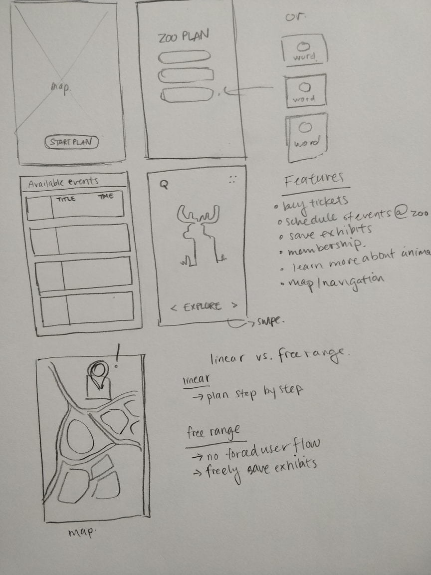
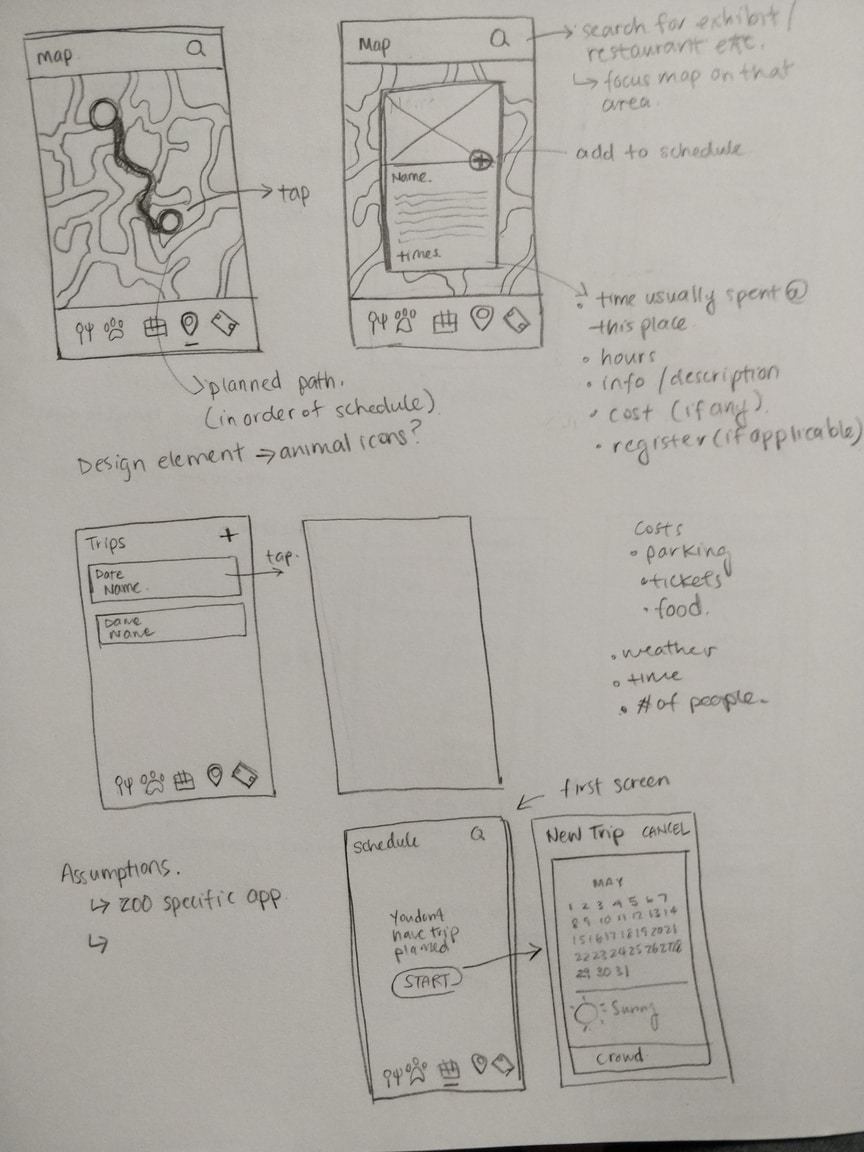
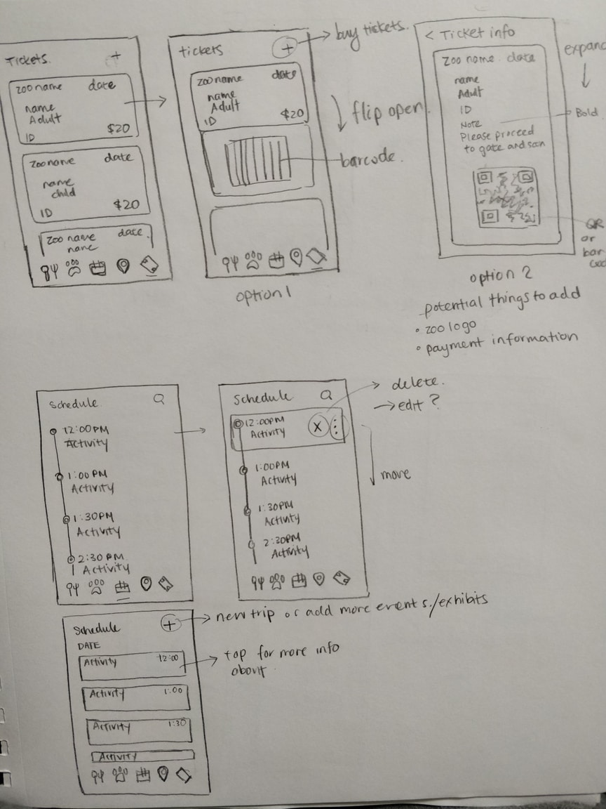
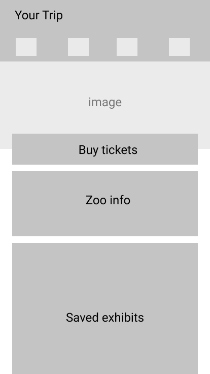
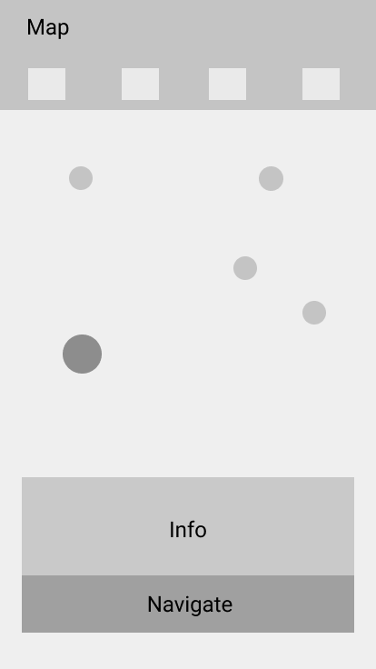
After brainstorming solutions, quick sketches of the look and feel of the app were done.
Planning
After brainstorming potential solutions, I started to pick which features I wanted in the app that would be useful in planning a day at the zoo.
Main features
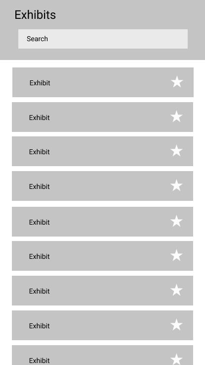
- Bookmarking exhibits, events, and restaurants/cafés
- Buy tickets and store them in the app
- Show weather, peak hours, and crowds
- Map of the zoo and navigation
- Animal information
User Flow
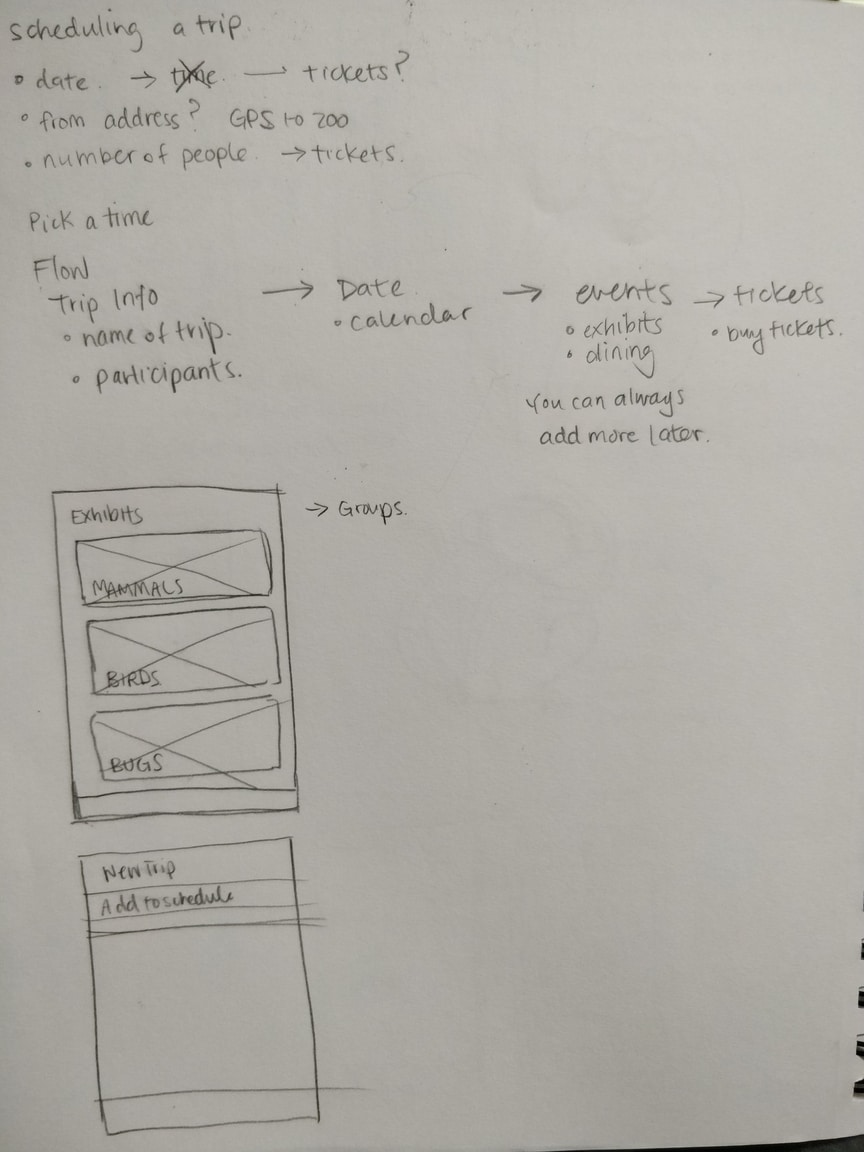
The next step in planning was to define the user flow. Two options were considered for the flow of this app:
Linear/forced flow
Pick a date -> Pick exhibits -> Create a schedule -> Buy tickets
This flow entails putting the user in a flow of creating a trip, picking specific exhibits, and then buying tickets in that order. The app would create a schedule of the day at the zoo with times set for each exhibit.
For example,
11:30 AM — African Lions
12:00 PM — Lunch at Leaping Lemur Café
1:00 PM — Red Pandas
Free range flow
This option includes freely saving exhibits, events, and restaurants/cafés if the user wishes to do so. Buying tickets and picking exhibits are not forced into one flow.
The free range flow was picked for the app. I showed both options to peers, asking which was preferred. They preferred to have the freedom of just saving exhibits and not have a strict schedule planned out. They also preferred buying tickets when they were ready to do so.
The App
Zoo Time is an app that helps users plan their visit to the zoo. The app is based on the San Francisco Zoo. Users can save exhibits and events, check crowds and buy tickets ahead of time for a fun and stress-free trip to the zoo. The app also includes information on animals, a map of the zoo, and tailored recommendations.
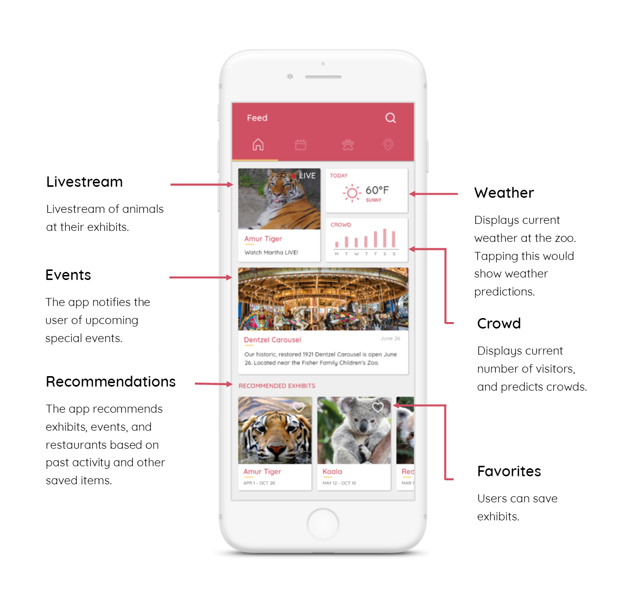
Home screen
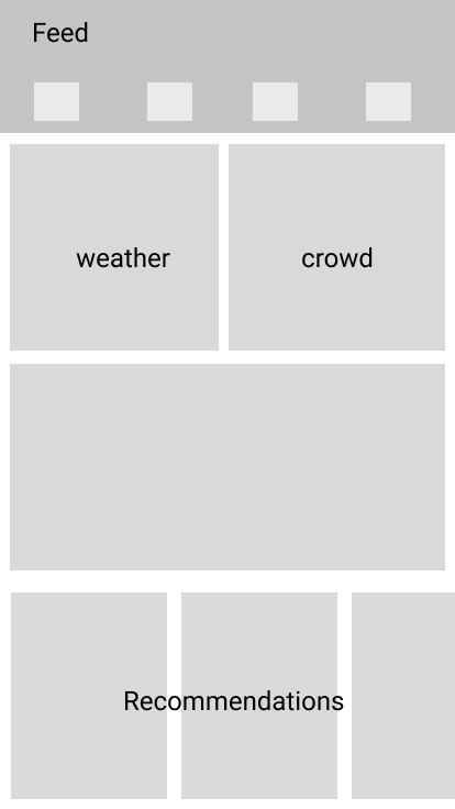
The first page of the app is the home screen. The home screen consists of a feed, showing information about weather, crowds, and recommendations. The feed could include special events, deals, and it could be tailored to the user’s budget.
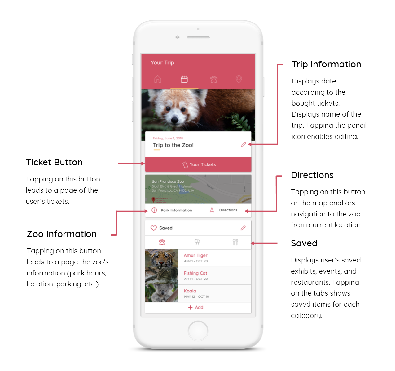
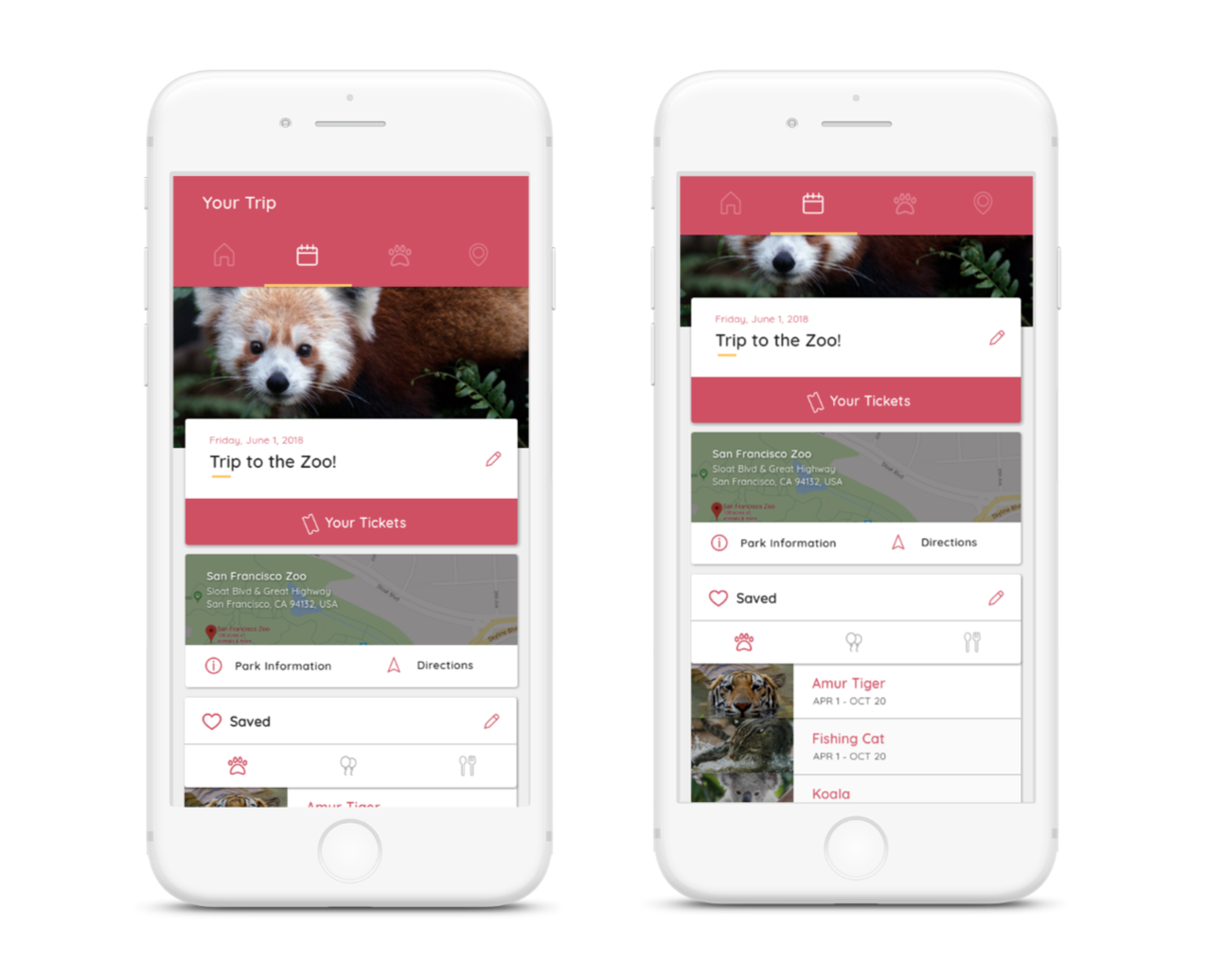
Your Trip
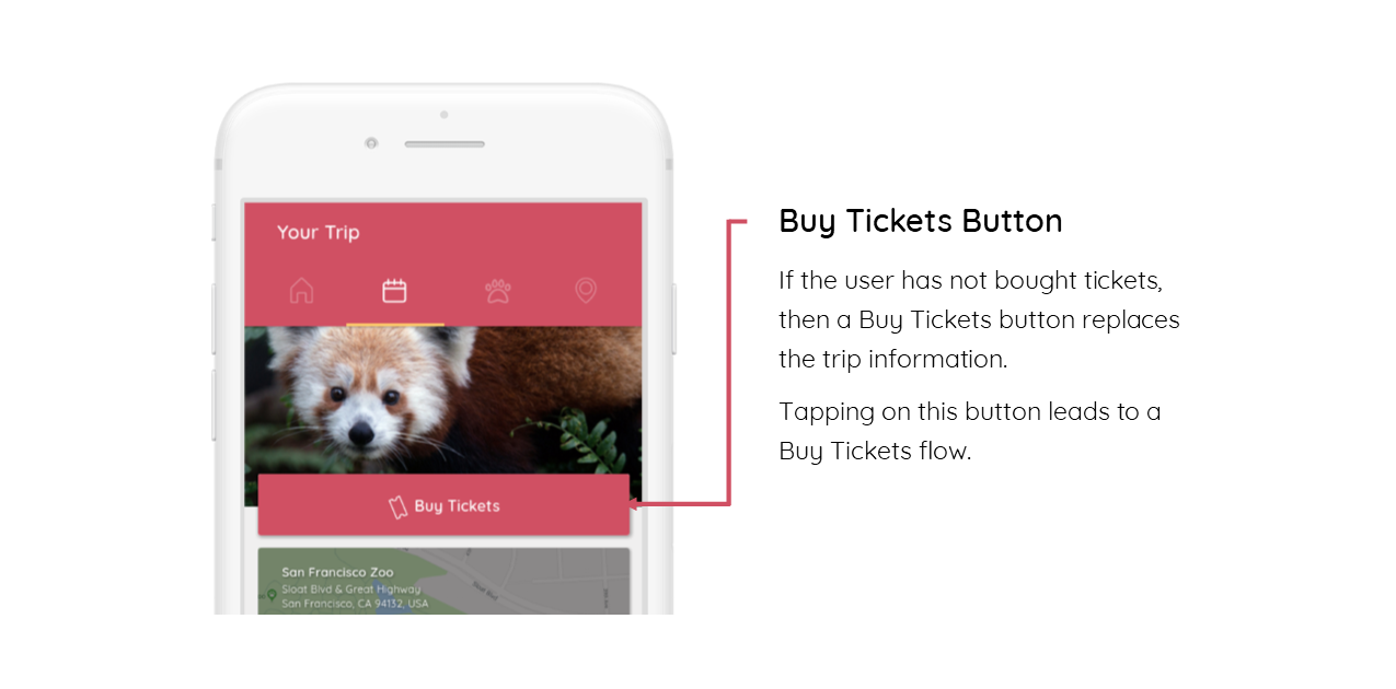
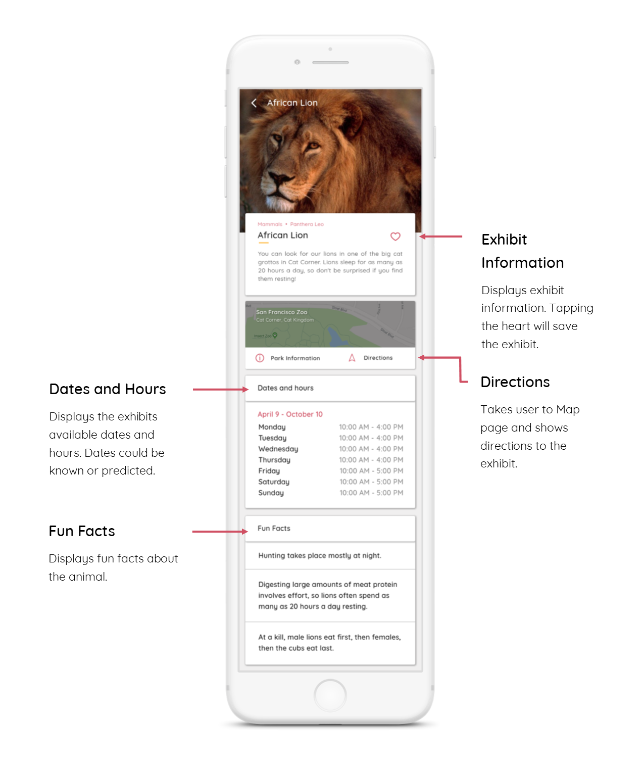
This page displays information about the user’s planned trip to the zoo. All saved exhibits, events, and restaurants are shown here.
Buy Tickets
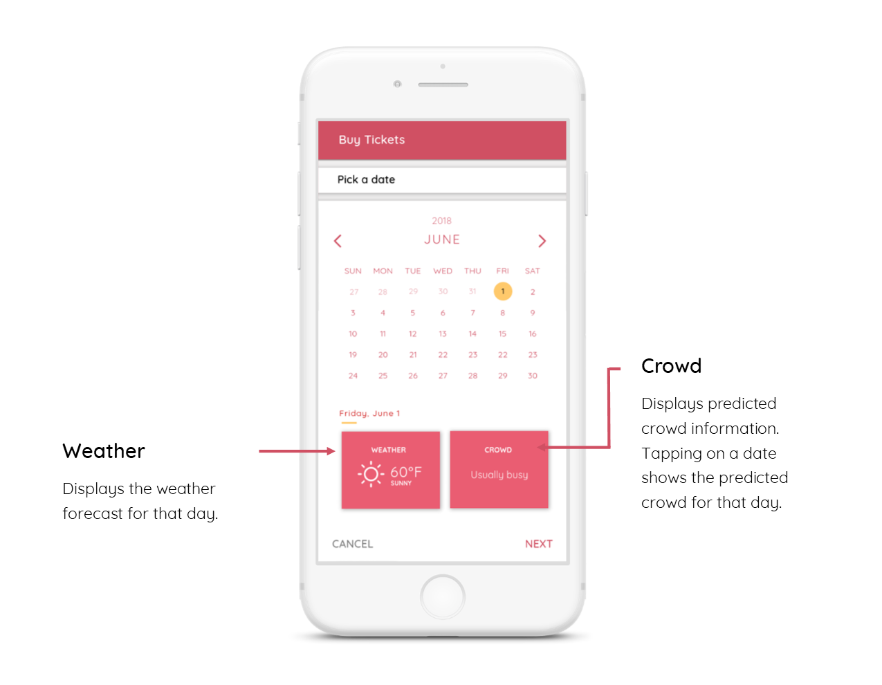
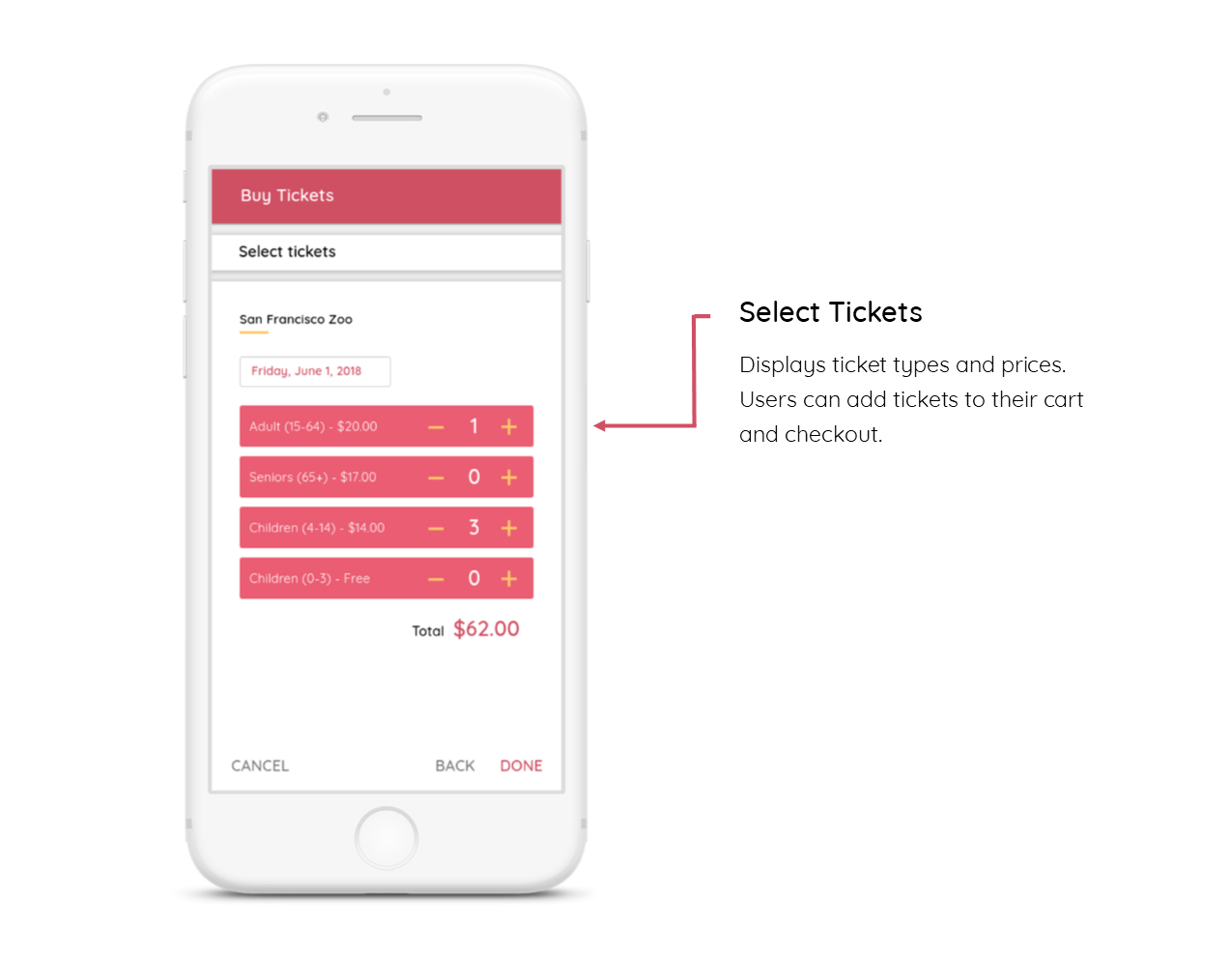
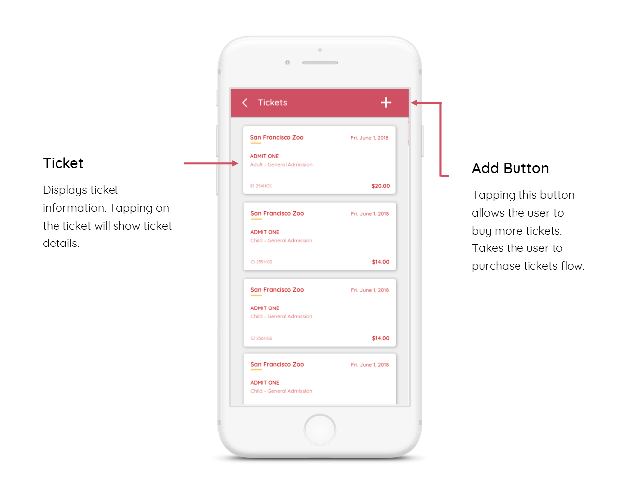
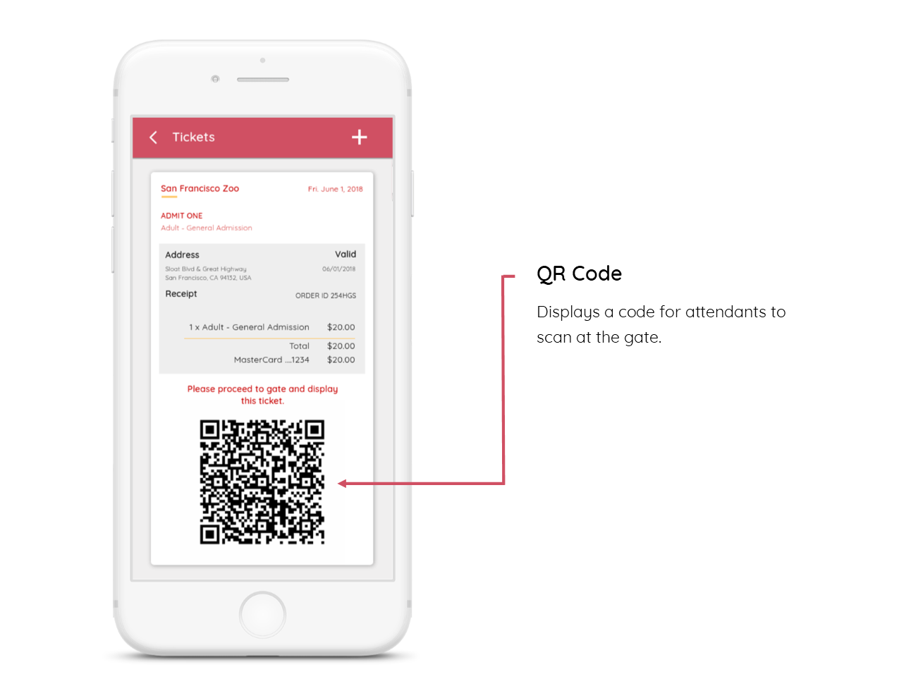
This flow displays the ticket purchasing process. It is accessed from the “My Trips” page with the “Buy Ticket” button.
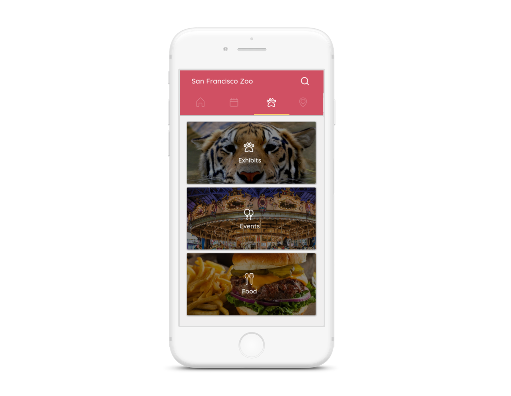
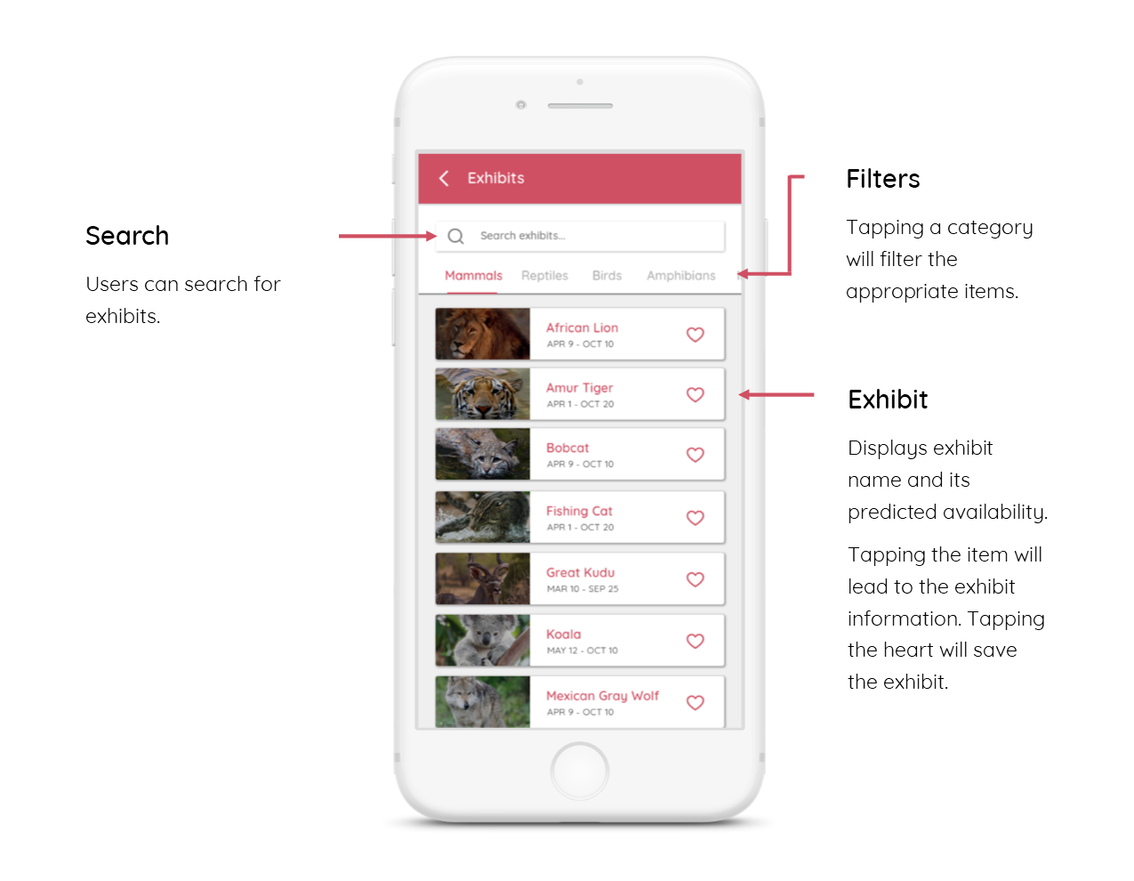
Exhibits, Events, and Food
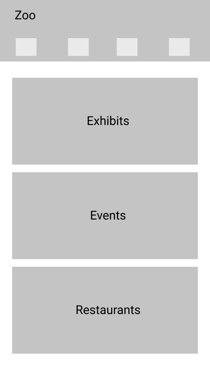
This page displays exhibit, events, and food categories for activities and places of interest at the zoo.
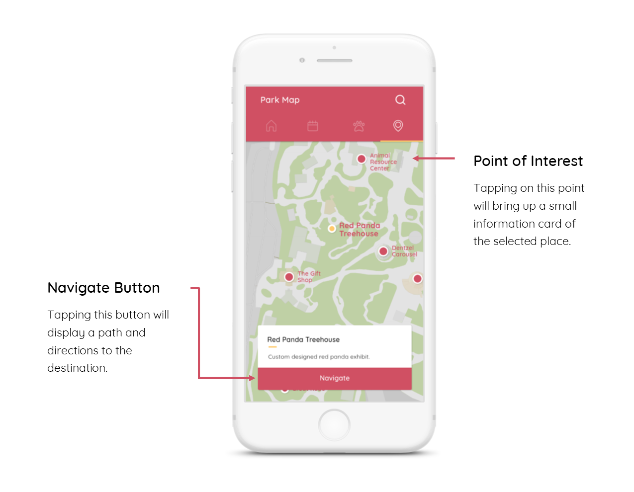
Park Map
This page displays the zoo map and points of interest on the map. The app guides the user in navigating to exhibits, events, restaurants, and bathrooms, etc.
Visual Design & UI
The color theme of this app is red, white, and yellow. Many colors and UI layouts were tested and quickly mocked-up. Since the app is centered around a zoo, I wanted a bright, energetic and fun feel to the app. Round and sans serif fonts were chosen to give the app a warm and friendly tone as children may be browsing through app to look for information about their favorite exhibits.
The user interface is designed with commonly used elements so navigation would be intuitive for the user. Top tabs were chosen instead of bottom tabs to prompt the user to swipe the screen instead of tapping on the tabs; this leaves the bottom open to other important tasks and gives the user an easier reach with their thumb. The top bar collapses to just the tab bar when swiping down through the content.
A monkey I drew for error pages and empty states
Ex. “You don’t have any tickets!”
Next Steps
The next steps for this app are to finish the purchasing ticket flow as the payment component is currently missing. Other refinements should be done to ensure the presented information is correct and possible (ex. Predicting when animal exhibits will be available). Testing is recommended to confirm the effectiveness of this solution. User research and user testing is recommended to further improve the user interface and the user experience.
